May 5, 2023

As a UX Digital Designer at a Webflow Enterprise Agency, I’ve witnessed firsthand how streamlining our internal processes has led to increased collaboration, cost efficiency, and creative freedom.
In this article, I’ll outline the changes we made and the tools we developed, which enabled us to reduce the average cost of our Webflow projects by around 30%.
Discovery: Digging for Golden Nuggets
The discovery phase is crucial for setting the stage for the entire project. It’s all about learning as much as possible about the company, the people, their goals, and ambitions. We dive deep and ask the right questions to unearth those hidden ‘golden nugget’ insights, allowing us to craft unique, on-brand experiences that delight and drive results.
Previously, our discovery process was bogged down with lengthy back-and-forth calls and technical spreadsheet documentation, eating up about 15% of the project’s total costs. Not only was this a mood-killer for our clients, but it also led to missed insights and unclear expectations.
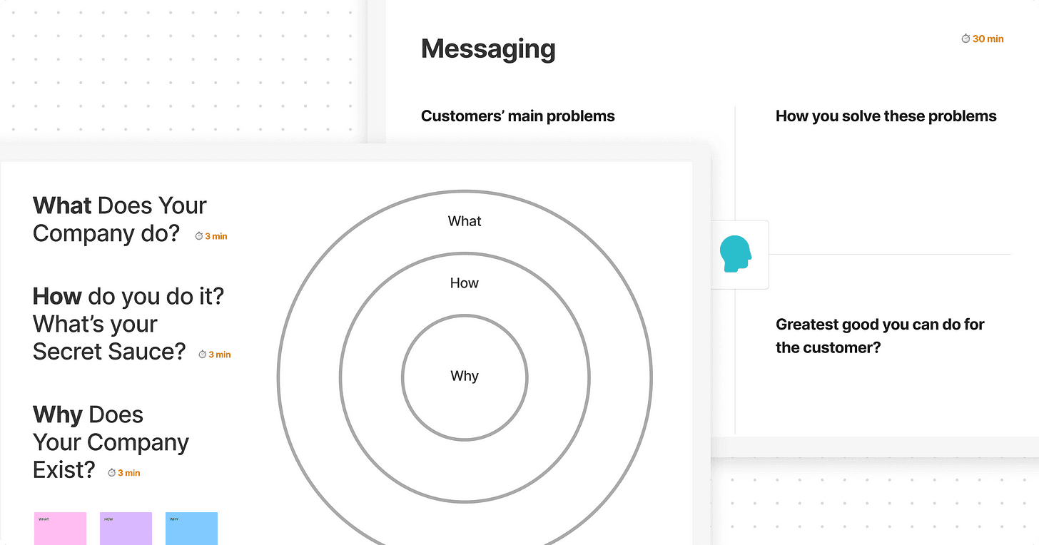
We revamped this process by introducing a combination of a discovery questionnaire, strategy workshops, site migration plans, sitemaps, and content plans. While this may seem like more to manage, it’s actually helped us reduce costs across the entire project timeline by balancing asynchronous requirements-gathering activities with engaging, virtual workshops.

A snapshot of our collaborative Webflow Strategy Workshops.
We also use low-code tools to eliminate repetitive tasks. For example, when clients fill out our discovery form, the results are added to a GDPR-compliant database, and our team is notified in Microsoft Teams, streamlining the preparation process.
Design: Fostering Collaboration with Figma
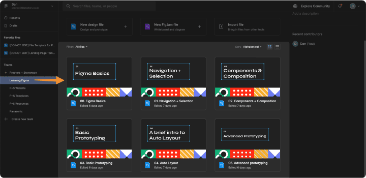
After we understand the project’s scope, we move on to structuring the website. As Adobe has tapered down feature development and support, we’ve switched from Xd to Figma, which offers improved collaboration, seamless integration, flexible plugins, and an intuitive platform with a robust commenting system.
To facilitate the transition, we created training resources, sandbox environments, and guidance documentation in Notion. We also standardised our design processes with file templates, design systems (style guides), and custom wireframe libraries, which simplified project handoffs between team members.

Development: Standardising Webflow Builds
To set solid foundations for our Webflow builds, we adopted a single class-naming system (client-first) and developed our own Webflow Website Starter Kit. The kit includes layout blocks, typography, colours, and UI elements like buttons and input fields. This starter kit saves us countless hours by managing all aspects in one place, so if we need to make a change, we can do it in a matter of seconds, and it cascades seamlessly throughout the entire project.
What’s Next: The Future of Our Process
This overview only scratches the surface of the improvements we’ve made, and our journey towards a more efficient process is ongoing. I plan to delve deeper into these tools and their value in future articles as well as explore the potential of low/no-code integrations and emerging technologies like AI.
This was a whole team effort, and I’m grateful for the opportunity to have led many of these initiatives and witnessed their positive impact on our projects. Keep an eye out for more content from me soon!


